top of page
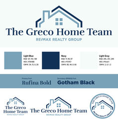
THE GRECO HOME TEAM
This project included a set of similar but distinct brands for Rich Greco and his daughter, Sam. The two styles utilize similar fonts and a shared dark blue to tie them together, while their accompanying colors and logo styles set them apart from each other.
The clients were provided with a set of custom colors, fonts, and logos, as well as brand materials like business cards, email footers, and sign panels. These included edited headshots for each.
Each public-facing asset was made compliant with REMAX and New York State real estate standards.

bottom of page


