Empathic Edge
Erin Halligan-Avery and Megan Herzog
When Erin and Rebecca first approached me, they had a beautifully thought-out brand, all the supporting materials I could ask for, and an AI-generated logo that didn't match any of it. The proposed palette had too many colors (including metallic gold), the logo had too many things going on, and it had the classic, overused 4-pointed star/sparkle. They wanted something soft and feminine like Rebecca, but also confident and unapologetic in its femininity, like Erin - so we needed to switch things up.
LOGO SUITE
SIMPLE BRAND BOARD


The Details
Aligning with the name, I gave the ladies different serifs and scripts to choose from. The scripts were flowy and emotional, like “empathic” implies, while the serifs were stricter, like “Edge,” but still soft enough to be feminine. They settled on the two fonts present in the logo: White Camellia and Celine. I added Figtree as an easy-to-read, round, and friendly body font. They wanted their brand to be feminine, sophisticated, but not so stuffy that it felt unapproachable.
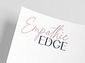
As for the primary wordmark design itself, I kept it very simple. I combined the two fonts with the words they represented, then fit “Edge” underneath the right end of “Empathic,” and added a piece of overlap to connect the concepts. The monogram was done similarly, and a second version was also created with the name in an arc, creating a literal edge on one side.
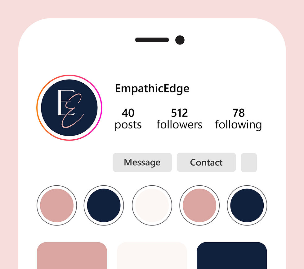
Finally, we narrowed their original palette from 6 colors to 3. Using two colors for the primary logo helped further contrast the words, while reserving the last color for a background. To showcase their colors, I gave Erin and Rebecca a simple Instagram mockup. The new palette was simple, clear, and sophisticated without losing the feminine vibe.
Overall, this short project was a great exercise in translating brand copy to visuals. Erin and Rebecca were lovely clients, and I hope to work more on their Empathic Edge brand in the future.